

Behind The Scenes @ Let's Move US
A look at the design decisions and meaning behind the Let's Move US logo and brand identity — from the two figures and the arrow, to the colors and the rings.
Gregory Gottfried
Let's Move US
As you probably know, if you’re already following us (and if not… welcome), we’re Let’s Move US. Our mission is simple: We’re looking to connect people of all ages with disabilities to adaptive sports and recreation programs. Obviously, that’s easier said than done — if it were easily done, we’d have done this a while ago — but we’re here now, and we’re working on bringing access to movement to everyone. Because everyone deserves that.
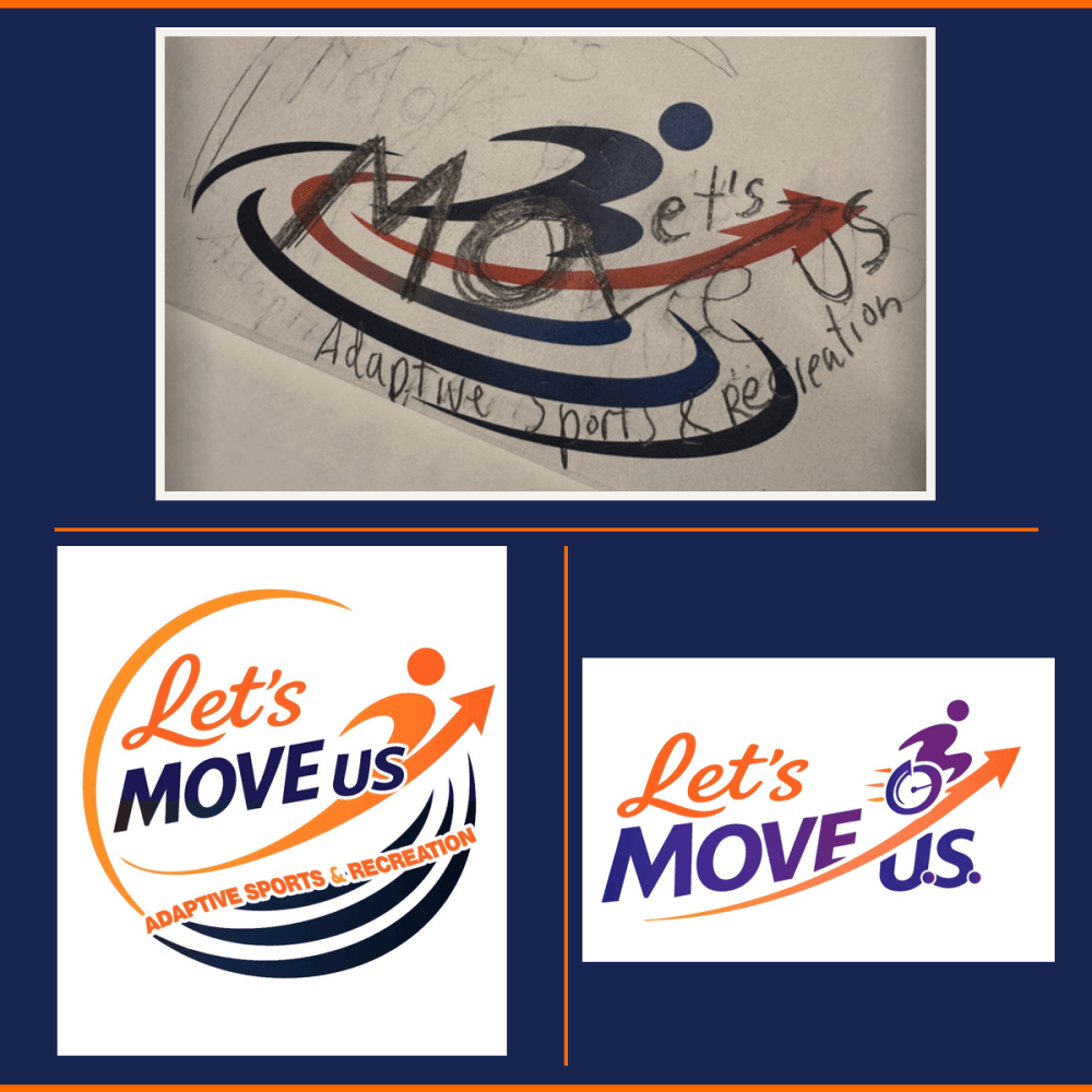
We thought it’d be fun to bring you behind the scenes, so you can see just how not simple this all is. For example, let’s start with our logo. Which you hopefully love. And if not, maybe don’t tell us that.
We worked with Etana Holowinko, MS, to bring all of our concepts together, and we’re proud of how it all shook out. Here is the cavalcade of thoughts and ideas that went into that logo:
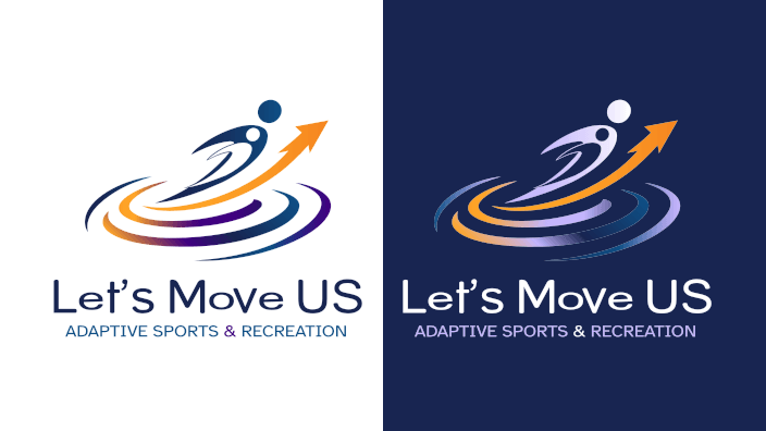
Two Figures
Two human silhouettes are shown in various sizes to signify that we’re trying to reach out to all sorts of people. There’s no age, body type or ability level, because that’s not what we’re about. And neither figure is “lesser” or “more dominant.” The two are working together to move in the right direction. And, as we all know, no one moves alone.
The Arrow
The arrow isn’t just moving upwards, but through and between the figures. They’re connected like we all are and heading toward something new. Personal growth isn’t a solo climb. It’s something we need one another for, moment by moment.
Colors
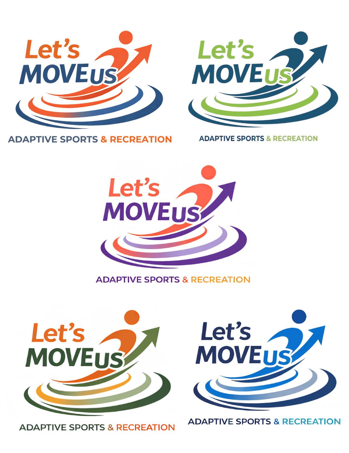
The navy color was chosen as deep blue signifies strength and confidence, as well as depth beneath the surface. Similar to a night sky, there’s an infinite amount of room to go. Orange, on the other hand, is about energy, enthusiasm and confidence. It’s a spark, and it’s why we started Let’s Move US. To bring that spark to more and more people.
The Rings
These could be seen as water ripples, action and reaction, to signify fluidness and adaptation. Plus, a positive butterfly effect in which our small actions can create far-reaching, overwhelming change when we least expect it. The ripples also show that nothing happens purely by itself. Every action we take will affect (and hopefully better) one another.
Or maybe you see sound waves, to represent impact spreading outward. Perhaps you noticed a footprint like the lasting impression we all try to leave. Maybe even an orbit because we’re all part of a community looking to better one another each and every day. These rings are something different to everybody. And don’t worry. You had the right answer, no matter what you saw.
You are always the stone and the shore receiving waves from others.
Also, it only makes sense that our work be readable for anyone who visits our website, which is why our fonts and colors are fully WCAG AAA compliant for those with low vision, color blindness, traumatic brain injuries, cognitive differences or light sensitivity. We wouldn’t be doing our job properly if everyone out there couldn’t see what we’re trying to do.
It means a lot to us that our brand makes sense from the first pixel. And think: If this much work and thought were put into our logo and brand identity, just wait to see what else Let’s Move US can (and will!) offer.
Share this post
Like this post? Share it with your friends!